Sunday, August 31, 2014

Keeping it Simple. Is that Good?

There seems to be dozens of proverbs advocating the wonders of simplicity. From the Quaker song of "It's a Gift to Be Simple" to more modern acronyms like: K I S S (keep it simple stupid), common wisdom would seem to call for human's need to simplify.

On a personal note, I am alone (temporarily) for the first time in the past 30+ years for and extended period. A friend inquired as to how I was doing and asked, "It must be simpler?" His assumption, not incorrect, is that being on my own would be simpler than when I'm with my family and balancing other peoples wants and needs along with my own. But along with it came a pang of despair and loneliness. So I asked myself if simple really is better?

I think we humans have a much bigger capacity, and desire for complexity than our common wisdom would profess. I think it has more to do with how things which are complex make us feel. In a TED talk I saw John Maeda of RISD uses an example of a sunset like the one below to demonstrate our capacity for complexity.

The photo on the left is rather complex; lots of detail to the beautiful sky. The clouds interacting with the light of the sun setting provides a myriad of shades of color, contrast and hue. I simplified the picture on the right. I selected one color and replaced the complex sky with a simple, single color. So, does that mean complex is really better? I don't think it's that easy. Perhaps it's an oversimplification to say that we humans have a large capacity for that which pleases us, and a desire to diminish that which is dis-pleasurable.

It seems we have the capacity for both the complex and the simple – a balanced coexistence more than a contradiction. Take these two rather well-known examples of art. Each is a picture of a woman, but the difference in Rembrandt's style to Picasso's is stunning. Rembrandt's detailed and complex drawing compared to the simplicity of Picasso…is one better? Or a symphony orchestra compared to a single melodic instrument. It's not even a matter of preference, as both can serve a purpose to enhance our lives…the complex and the simple.


Tuesday, July 8, 2014

Seeing the Accidental...the Creative Eye


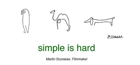
‘The creative mind doesn’t have to have the whole pattern—it can have just a little piece and be able to envision the whole picture in completion.’   — Art Fry

I believe that creativity comes in many forms. Accidents are one of those forms. There is a long history of items that started out to do one thing, and accidentally became another. Of drugs that were intended to cure one disease, but were found to treat something quite different. The infamous story of Post It notes is a great example.
According to wikipedia
In 1974 Fry attended a seminar given by another 3M scientist, Spencer Silver, on a unique adhesive Silver had developed in 1968. Silver's innovation had an unusual molecular structure, yielding an adhesive strong enough to cling to objects but weak enough to allow for a temporary bond. At the time, Silver was still searching for a marketable use for his invention.
As the legend goes, Fry was at school when he came up with the perfect application. Fry sang in his church choir on nights, and he used slips of paper to mark the pages of his work book. When the book was opened, however, the makeshift bookmarks often moved around or fell out altogether. On a Sunday in 1973, it occurred to him that Silver's adhesive could be put to use to create a better bookmark. If it could be coated on paper, Silver's adhesive would hold a bookmark in place without damaging the page on which it was placed.
The next day, Fry requested a sample of the adhesive. He began experimenting, coating only one edge of the paper so that the portion extending from a book would not be sticky. Fry used some of his experiments to write notes to his boss. This use led him to broaden his original idea into the concept that became the Post-it note.    

Seeing the accidental in graphic art and design is no different. One of the classic examples is the Federal Express logo. The typeface is Futura; nothing creative in that per se. The creativity comes in when the designer sees what is almost there! The accident of the arrow that's formed between the E and the x. (if you've not noticed the arrow before you will from now on!) With some artful adjustments, futura is transformed into a brilliant logo and example of negative space.
It's like the Michaelangelo quote: ‘I saw the angel in the marble and carved until I set him free.’

Fenway Group Design BostonWe just completed a logo design project for one of our clients. The project was to design a look for a youth singing group at a faith-based organization. The challenge involved trying to design the logo in 2 languages: English and Hebrew! The name of the group is Rimonim, which means pomegranate in Hebrew. Although the concept below was not the final logo chosen, I think it's another great example of seeing the accidental, the almost there. Our designer, Dave Scott, was able to see the Hebrew embedded within the Latin letter shapes. The concept shows shows the Hebrew letters in green, contained within the blue English word. Again, once you see it...it sticks. What's remarkable is that Dave does not know Hebrew, yet his eye was able to look beyond language...to me that's creativity.

(BTW, to see the final logo version Click Here)


Monday, June 30, 2014

The Pressure of One

There's something different about our large format projects than our regular sized printed projects.
Many of these large projects are exhibits custom created for the space in which they'll be displayed. Although many of our printing projects are in quantities in the tens of thousands, and require exacting quality control, most of our displays are for just one. Seems ironic somehow that there is more pressure in getting one right, than 1,000's.

7-panel donor exhibit at Boston Children's Hospital
There are a couple of different challenges with exhibits; each daunting but very different from each other.

The first is the physical. The physical challenge of these exhibits lies in the uncertainty of the installations and the size. It's very difficult to test fit a 20' x 16' wall when you don't have one just hanging around. Also we've discovered that there is really no such thing as a smooth wall, level floors or even surfaces when it comes to installing exhibits. So, we measure twice, cut once, and bring a few extra pieces of stuff for the 'just in case' we need this.

Rashi School Library - Core Values project
The other challenge lies in environmental transformation that these projects entail. These exhibits literally change the space in which they exist. When our work becomes part of the environment that people see regularly the impact is even larger than the size of of the exhibit.

The ultimate challenge, I think, is having one shot to get it right. After all the proofing and measuring, the real test is how it fits. Like any other visual project we do, at the end of the day, does the design and execution 'fit' the space? Reflect our client's voice? When it does…it becomes an enduring impression.
Simmons College Natatorium Records Board


Tuesday, June 10, 2014

When our work is a Blessing


In our world of deadlines and production it is easy to lose sight of the importance of the products we create. Mixed into the rush of direct mail, business cards and brochures is the fact that our work has significance and meaning for its intended audience. An invitation to an event becomes the way a community connects. A program book becomes the one common element that an entire group of people follow and rely on for information; and the souvenir that someone will keep. In context, these pieces are no longer ‘ink on paper’. They transform into much more. 

I’ve been able to witness this transformation throughout my career. An easy example is just having finished printing diplomas for several of our academic clients. To the recipient the piece of paper they received is much more than 100# natural white stock digitally printed. It represents accomplishment and achievement and will likely be kept in a prominent place for the remainder of their lives.


I had the privilege last Friday night of participating in a prayer service to welcome the Sabbath using a prayerbook that we had spent the past 6 months designing, revising and printing. The Jewish Friday night service which welcomes the Sabbath is a beautiful and meaningful series of prayers and psalms that date back centuries. The goal of this version was to give everyone access to those prayers and psalms not only by offering Hebrew, English and transliteration but also in a bounty of graphic elements and additional readings interspersed throughout the pages.


Although the ritual is old, the prayerbook is very new and a reflection of our client, Temple Beth Zion in Brookline, Mass. The congregation has two beautiful faith quilts that were created by the community that adorn the sanctuary. We used elements of those quilt tiles on the pages of their new prayerbook. Additional readings from both its rabbis, Reb Moshe Waldoks and Rav Claudia Kreiman, along with writings of Abraham Joshua Heschel, Art Green, Rami Shapiro and others all represent the special spirit that exists at ‘TBZ’.


Friday night was very special indeed. To see a community coming together to celebrate the Sabbath using a book that we helped to create was deeply impactful and emotion filled. For me, the book was no longer an InDesign file nor ink on paper. It had transformed, as if by magic, by its very use and meaning — the profane had transformed to the sacred. 


Pages from Siddur (prayerbook)